


It always starts with the logo file. Someone walks into the meeting, USB stick in hand, and sets it on the table like it’s the Holy Grail. “Here’s our brand,” they say. The logo glows on the big screen, everyone nods, and for a moment, there’s a sense that the hard part is done. Fast forward three months: the website is live, traffic is trickling in, but something feels off. The phone isn’t ringing. The inbox is quiet. A manager scrolls through the homepage for the tenth time, muttering, “Why does it feel like we’re missing something?”
This scene is painfully familiar. Over a hundred projects in, we’ve seen it play out in retail, healthcare, hospitality — the industry doesn’t matter. The pattern is almost always the same: huge energy poured into the logo and colours, but when real visitors land on the website, the experience doesn’t match the promise. The end result? Confusion, lost trust, and—far too often—a brand that’s invisible instead of memorable.
So let’s get painfully honest about what “brand” actually means on the web—and why your logo and your website are only the beginning.
The Logo Illusion
If we had a euro for every time someone equated their brand with the logo, we’d have enough to sponsor a year’s worth of stock photography. The mistake isn’t malicious—it’s just deeply engrained. Businesses spend weeks with designers, adjusting kerning and colour palettes, and assume that once the logo is right, everything else will fall into place.
What most businesses miss is that a logo is just a signal, not a story. It’s a shortcut for recognition, not a substitute for reputation. In website projects, we see clients obsess over pixel-perfect placement of the logo, but rarely ask: “What will someone remember about us after they close the tab?”
A brand identity runs deeper. It’s not what you show people—it’s what they feel after interacting with you. And online, that feeling comes from dozens of signals you send, intentionally or not, with every click and every word.
What Brand Really Means—Online
Here’s a hard truth: your website is not your brand, either. It’s just the stage. What actually defines your brand is how consistently you deliver on the promises you make—visually, verbally, and operationally. The website is only as strong as the alignment between what you say and what users experience.
We see it all the time: a website promises “fast, personal service” and then buries the contact form three pages deep. Or the homepage claims “the region’s leading experts”—but the first blog post is from 2021, and there’s not a credential in sight. The mismatch isn’t just cosmetic. It kills trust in seconds.
If you want real brand consistency, you need to scrutinise the entire digital journey:
- Is your tone of voice the same on every page?
- Do your calls to action match what you actually deliver?
- Are your promises visible in the smallest details—like error messages, loading screens, and email replies?
Brand Consistency: Where Most Businesses Slip
The pattern we encounter most often is a gap between brand strategy and real-world execution. The strategy deck says “approachable and modern”, but the web copy reads like it was written by a committee in 2004. Someone picks a bold brand colour, but the product shots don’t match. There’s a logo in the header, but the FAQs are copy-pasted from a competitor’s site.
One conversation sticks in my mind: “We’ve been live for six months and nobody calls,” the client said. We looked at the site together. The phone number was there, technically—buried in 8pt font, in a shade of grey that might as well have been invisible. The brand said “easy to reach,” but the website said, “good luck finding us.”
This misalignment isn’t just a design problem. It’s a trust problem. Every time what you say doesn’t match what users see or feel, you lose a bit of credibility. And online, you rarely get a second chance.
The Real Work: Tone, Details, and the Promises You Keep
What separates memorable brands from forgettable ones is the discipline to translate their identity into every digital touchpoint. It’s about the tone of your microcopy, the clarity of your navigation, the follow-through on your promises. These aren’t glamorous jobs, but they matter far more than logo placement.
Across 100+ client projects, we’ve learned that digital branding succeeds or fails in the details:
- A checkout page that reassures, instead of confuses
- A contact form that gets a real reply, not a canned auto-response
- A mobile experience that feels as considered as the desktop
This is the unglamorous, daily work of brand consistency. It’s not about wowing people with your logo—it’s about not letting them down when it matters.
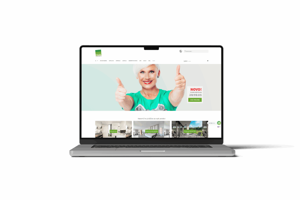
A Real Example: When the Storefront Matches the Promise
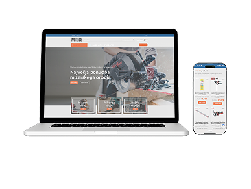
When Roakon delivered an online store for a Slovenian retailer (one of more than 30 we’ve launched), the brief was clear: “Our customers expect reliable delivery and honest advice.” Easy to say, much harder to prove online.
We built the digital experience around those promises. The shipping policy was upfront—no asterisks, no fine print. Every product page had real staff recommendations, not generic blurbs. After launch, the support email wasn’t hidden in a footer; it was right where customers needed it. The result wasn’t just a website that “looked on brand”—it actually delivered the brand, in every interaction.
This is what we see across projects: the brands that win aren’t the ones with the flashiest assets—they’re the ones whose digital experience matches what they’ve promised offline.
How to Close the Gap Between Brand Promise and Reality
If you want your digital brand to mean something, you have to get brutally honest with yourself about the gap between what you promise and what you deliver. Here’s what works (and what doesn’t):
- Audit your site as if you were a sceptical visitor—what would you actually believe?
- Scrap any claims you can’t back up immediately, on the page
- Standardise your tone of voice, not just your visuals
- Test real user journeys—don’t assume your intentions are obvious
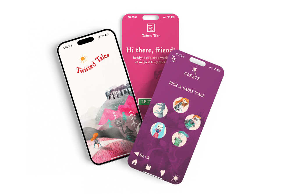
This is the approach Roakon has taken on every project, whether we’re building a mobile app, a hospitality site, or a logistics platform. The technology is important, but the experience is everything. That’s how you go from being just another website to a trusted brand.
What Actually Builds a Brand Online
In the end, your brand isn’t your logo, your colour palette, or even your website. It’s the sum of every promise you make—and keep—online. The businesses that get this right don’t just stand out; they earn trust, loyalty, and word of mouth. The rest blend into the background, wondering why the emails never come.
If you’re serious about digital branding in Slovenia—or anywhere else—remember: the magic isn’t in the assets. It’s in the experience. And that’s something you have to design, test, and protect every single day.
Let’s build something great together!
Ready to take your digital presence to the next level?
Reach out to us at info@roakon.eu and let’s create something remarkable.