


You refresh Google for the third time this morning, searching for your own company. There it is—your competitor’s bland, two-shades-of-grey website sitting above yours. Again. You stare at your own homepage: it’s modern, polished, practically worthy of an award. Theirs looks like it was last updated when flip phones were cutting edge. And yet, week after week, they’re the ones getting the traffic, the calls, the leads.
Someone from sales walks by and asks, “Didn’t we just spend months and a small fortune redesigning?” You nod, but you’re already opening another SEO tool, looking for answers. If you’ve ever wondered how a website that looks like a PowerPoint template can outperform your carefully crafted design, you’re not alone. The pattern is almost always the same, and it rarely has anything to do with how a site looks.
The Big Misconception: Design Equals Performance
What most businesses miss—especially after a major redesign—is that Google does not reward pretty. We see it across projects: a client launches a visually stunning site and expects an instant jump in rankings. Instead, traffic stalls or drops. Meanwhile, the “boring” competitor climbs higher.
Here’s the reality: search engines don’t care about your design awards. Google’s algorithm can’t appreciate a clever animation or a perfectly balanced colour palette. It evaluates structure, speed, stability, and clarity. When those are missing, no amount of visual sophistication can compensate.
Core Web Vitals: The Unseen Ranking Powerhouse
If there’s one technical topic that comes up in almost every project lately, it’s Core Web Vitals. These are Google’s measures of user experience—how fast your website loads, how quickly it becomes interactive, and how stable it is while loading. The names are a mouthful: Largest Contentful Paint, First Input Delay, Cumulative Layout Shift.
Here’s what this means in plain language:
- Speed: Your site needs to load quickly. Every second of delay costs you ranking positions (and real users).
- Interactivity: Users should be able to click, scroll, and interact as soon as they arrive—not after your slider finishes loading.
- Stability: Content shouldn’t jump around as ads or images load. This frustrates visitors and signals poor quality to Google.
We’ve reviewed more than 100 client sites. The ones that struggle in rankings almost always have beautiful images, oversized videos, and heavy animations—at the expense of speed. Meanwhile, that “plain” competitor’s site loads in under a second and climbs higher. It’s not magic; it’s measurable.
Heading Structure: The Skeleton Google Reads
It’s easy to forget that Google doesn’t see your site like a person does. It reads code. Specifically, it looks for order and hierarchy—and that means heading tags (H1, H2, H3, etc.). This is where most beautifully designed sites go wrong.
We see it all the time: designers use headings for visual emphasis, not structure. The homepage hero might have three H1s because “it looks good.” Or, worse, there’s no proper H1 at all. When Google scans your page, it expects a clear outline—like the table of contents in a book. If your headings are out of order or missing, your content is harder for algorithms to understand and rank.
The pattern is almost always the same. Clients ask, “Why aren’t we ranking for our main keywords?” We check their site and see headings scattered like confetti. The solution is never to make it uglier—just to give it a backbone Google can actually follow.
Internal Linking: The Quiet Ranking Multiplier
Another overlooked factor: internal linking. This is your site’s way of telling Google what matters most. Every link from one page to another is a signal—an endorsement of what’s important. The most effective sites use internal links to guide visitors (and search engines) to their most valuable pages.
The competitor outranking you? Chances are, their site has a logical web of links connecting key services, products, and blog posts. Most visually focused sites, on the other hand, hide their important pages behind fancy navigation or forget to link altogether. The result: Google can’t tell what’s important, and rankings suffer.
A real dialogue from a recent project: “We’ve been live for 6 months and nobody calls.” We ran an audit and found their main service page was three clicks deep, with no internal links pointing to it. After restructuring and adding strategic links, calls started coming in—without a single design change.
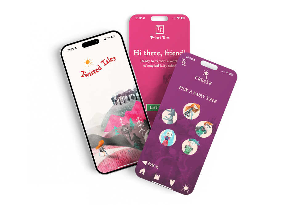
What We’ve Learned from 100+ Projects at Roakon
After working with over 100 clients, delivering 30+ online stores, and building 20+ web and mobile apps, the lesson is clear: Google rewards clarity, speed, and order. Design is important—it’s the first impression for your users. But for ranking, technical optimisation is what moves the needle.
At Roakon, we’ve seen beautiful sites stall out on page two until we optimise headings, compress images, and build out proper internal links. The transformation is rarely about making things “uglier”—it’s about making them smarter, cleaner, and easier for both people and algorithms to understand.
The pattern is so consistent, it’s almost predictable: fix the technical fundamentals, and organic traffic follows. Skip them, and even the most beautiful site struggles in silence.
How to Tell If Your Site’s Design Is Hurting Your Ranking
If you suspect your site’s beauty is masking deeper problems, here’s what to check right now:
- Run a Core Web Vitals test (Google PageSpeed Insights is free). Are you in the green?
- View your page’s source code. Is there a single, clear H1? Do headings follow a logical order?
- Click through your own site. Can you reach your main services/products in one or two clicks? Are there contextual links between related content?
If you’re seeing red flags, you’re not alone. The majority of businesses we work with at Roakon arrive with similar issues. The fix is usually less about a redesign and more about technical optimisation and content structure.
A Real Example: How a “Plain” Store Outranked a Designer Brand
One of the most telling cases from our portfolio: two competing online stores in the same niche. Store A—visually basic, but lightning fast, with clear headings and a web of internal links. Store B—designer-crafted, image-heavy, slow to load, headings all over the place.
Guess which one ranked higher (and converted better)? Store A—by a wide margin. When we applied Store A’s technical discipline to Store B (compressing images, fixing headings, adding internal links), Store B’s rankings and sales finally started climbing.
The lesson: it’s not about choosing between beauty and ranking. It’s about respecting the rules that Google plays by. Ignore them, and even the best design can’t save you.
Most businesses lose sleep over how their site looks. The ones that win pay just as much attention to how their site works—for both users and search engines. If you want to outrank plain competitors, you need to get the invisible details right.
Let’s build something great together!
Ready to take your digital presence to the next level?
Reach out to us at info@roakon.eu and let’s create something remarkable.