


“Why can’t I find tonight’s menu? Did they close?” The voice from across the desk is exasperated, half-laughing, half-serious. Luka spins his monitor: there’s a restaurant website open, or rather, loading. The spinning circle has been there for seven seconds and counting. The only thing visible is a background image of a couple clinking wine glasses—clearly a stock photo. No menu, no opening hours, not even an address in sight.
This scene plays out more often than anyone in hospitality wants to admit. A team member, eager to book a table for a client lunch, gives up and picks the competitor down the street because their website loads instantly, shows their lunch menu with prices, and even lets you reserve directly. Five minutes later, another booking lost—not because of food, not because of service, but because the website made it too hard to say yes.
If you’ve ever wondered why your tables aren’t filling up as fast as they should, you’re not alone. After working with over 100 businesses—many in hospitality—here’s what actually makes someone book a table, and what sends them running to a rival next door.
The Split-Second Test: Can I Find What I Need?
Most people don’t browse restaurant websites for fun. They have a goal: book a table, check the menu, or see if you’re open. If they can’t do that in under a minute, they’re gone. Across dozens of projects, we see the same pattern—sites that bury essentials behind four clicks or load so slowly you could cook a risotto in the meantime.
The difference between a booking and a bounce is often something basic: hours and address right at the top. If your site makes someone squint to find when you’re open or where you are, they’ll just Google someone else. This is not theory—it’s the comment we hear in every feedback workshop: “I just want to know if they’re open and nearby. If I can’t find that, I move on.”
PDF Menus: The Silent Booking Killer
Few things frustrate diners more than the dreaded PDF menu. You know the story: someone on their phone, hungry, squinting at a download button. They tap it—nothing happens or, worse, it downloads a 10MB file and crashes their browser. By the time it opens, the only thing they’re hungry for is a different restaurant.
- PDFs don’t work on mobile—where 70% of bookings now happen
- No SEO benefit—Google can’t index your menu items
- Prices often missing or outdated
We’ve seen restaurants increase online bookings by double digits just by switching from a PDF to a clear, mobile-friendly, on-page menu. It doesn’t need to be fancy—just readable, current, and clickable. If you want to frustrate fewer guests, retire the PDF. Your chef will thank you.
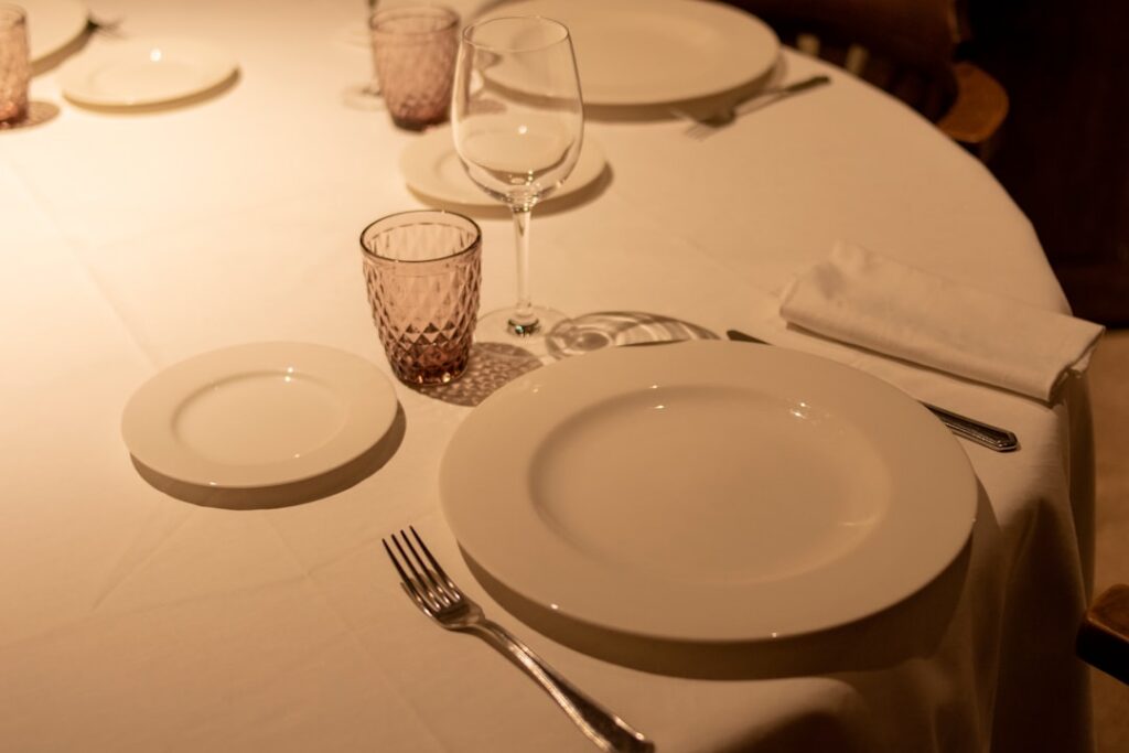
Atmosphere: People Book What They Can Picture
There’s a reason stock photos don’t sell tables. They tell diners nothing about the experience. Is it cozy? Bustling? Elegant? When your homepage looks like it could be any cafe in the world, you’re not building trust—you’re making people wonder what you’re hiding.
We see the difference every time a client switches from generics to real atmosphere shots. Suddenly, bookings go up—because people picture themselves at your tables, not just some table. It’s not about expensive photography. It’s about real images: staff setting up, actual diners, the lighting at golden hour. If you can’t afford a pro shoot, use a decent phone camera and a steady hand. Reality always beats perfection.
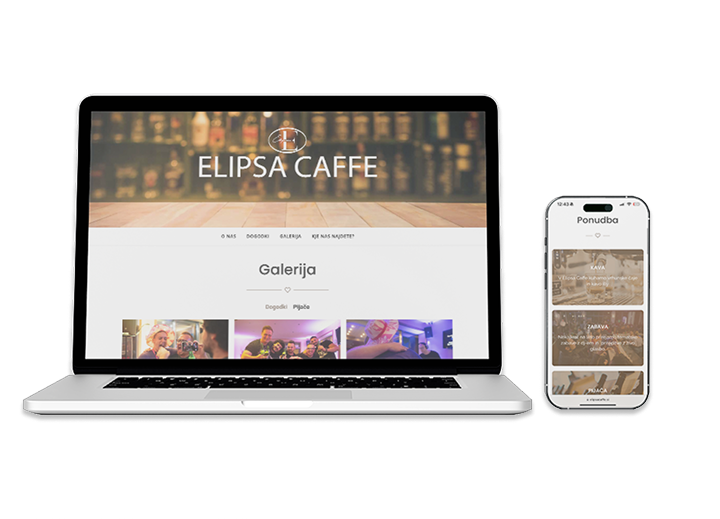
One of our long-term clients in Ljubljana replaced their stock header with a candid shot of their terrace during a summer evening. Within weeks, their bounce rate dropped, and the first thing diners said when arriving was: “It looked just like the photo.” That’s the reaction you want.
Menus with Prices: No Surprises, No Stress
Hiding your prices is a fast way to lose trust. Diners want to plan—not just what they’ll eat, but what they’ll spend. When the menu is a mystery, many will assume the worst (“must be expensive”) and book elsewhere. We see this across all hospitality segments, from fine dining to family-run cafes.
Listing prices signals transparency. It sets expectations. Most importantly, it lets people make a quick decision. As one client told us, “We put prices up, and almost overnight the ‘are you in our budget?’ calls stopped.”
Direct Booking: The One-Click Advantage
This is where too many sites still trip. A button that says “Book Now” should, well, book now. Not launch an email form. Not ask you to call between 11:00 and 14:00. Not redirect you to social media. Every extra step is a lost diner.
The best-performing restaurant websites in our experience all have a direct booking link on every page. It’s visible, works on mobile, and actually confirms your table. It’s not about fancy integrations—just make it obvious and easy. If you want people to book, don’t make them hunt for the way in.
We’ve built more than 30 hospitality websites at Roakon, and every time a client hesitated about adding direct booking (“But won’t they just call us?”), the data said otherwise. People book more when it’s one tap away. Less friction, more tables filled.
Don’t Ignore Google Reviews—Or Your Own Reputation
Before making a booking, people check your reviews—even if it’s just a glance at the stars. Sites that make it easy to see real feedback outperform those that hide it. A simple widget, a link, or even a quote from a recent review can make all the difference.
On a recent project, a restaurant owner said, “We’ve been live for 6 months and nobody calls.” Their Google listing had 4.7 stars, but their website didn’t mention it anywhere. After adding a review badge and a few choice quotes, bookings picked up. It’s not magic—just social proof at work.
If you want to convert browsers to diners, put your best reviews front and centre. People trust other people more than a homepage headline. At Roakon, we’ve seen this small change drive measurable increases—especially for newer venues trying to build a reputation fast.
The Most Common Fails (and How to Avoid Them)
After working with 100+ clients, the patterns are clear. Here’s what tends to go wrong, and what to do instead:
- Loading times over 5 seconds—usually due to oversized images. Compress and resize everything.
- No mobile version—test your site on your own phone, not just a desktop.
- Missing address—always put it in the header or footer, not buried in “Contact”.
- Stock photos—replace with real photos, even if they’re not perfect.
- PDF menus—switch to an on-page menu with prices and daily specials.
These aren’t just pet peeves—they’re the reasons diners leave for the competition. At Roakon, every restaurant or cafe website we build gets stress-tested for these exact points. If you want more bookings, fix these before you spend a cent on ads or social media.
A great restaurant website isn’t about bells and whistles. It’s about making it easy for someone to imagine a night out—and then press “Book”. The difference between a full dining room and empty tables is usually just a few clicks away.
Let’s build something great together!
Ready to take your digital presence to the next level?
Reach out to us at info@roakon.eu and let’s create something remarkable.