


Luka stared at his inbox for the third time in half an hour. The Google Analytics dashboard was open on a second monitor — a parade of visitors, sessions, and average times on page. The numbers weren’t spectacular, but they were steady. The kind of traffic you’d expect for a well-rated plumbing business in Ljubljana. But the email form was quiet, and the phone on his desk hadn’t rung in days.
He scrolled through his own website, reading it as if he were a stranger. What was missing? He’d invested in good photos, the logo looked sharp, and his prices were fair. But the silence was starting to feel personal. He messaged his developer: “We have a hundred people a week on the site, but nobody calls. Are we invisible?”
This is the moment we see again and again. Traffic isn’t the problem. The real question is: why is your website not generating leads? The answer is painfully specific, and almost always one (or more) of the same five culprits. Here’s how it actually plays out.
1. The Vanishing Call to Action
The first place we look is the most obvious — but so often overlooked it’s almost a running joke in the agency world. The site tells visitors what the business does, but nowhere does it say what they’re supposed to do next.
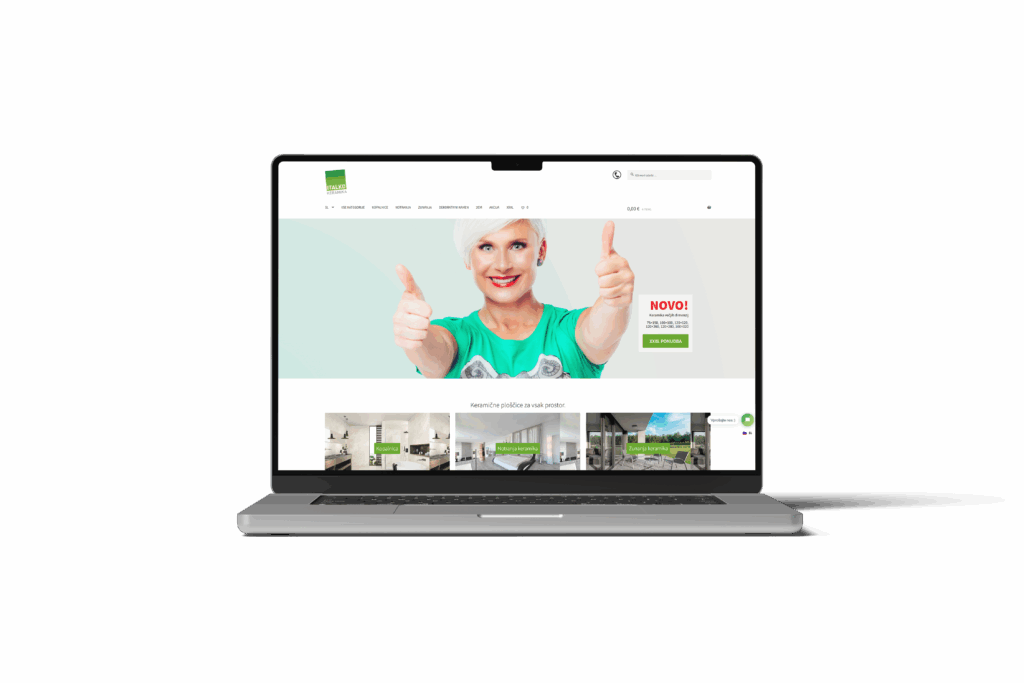
A surprising number of service business websites bury their contact details in the footer, or use ambiguous buttons like “Learn More” instead of “Book Your Free Consultation.” We’ve developed over 100 websites and, frankly, most sites we’re asked to “fix” have this exact issue.
Here’s a quick checklist:
- Is there a button above the fold that says exactly what you want the visitor to do?
- Is the phone number visible on every page, not just the contact page?
- Are there multiple ways to get in touch — form, phone, chat?
It’s not about shouting. It’s about removing all ambiguity. If you want enquiries, say so — clearly, and often.
2. Trust Signals: Missing in Action
Even when a potential client wants to call, their next thought is: “Can I trust these people with my money, my property, my data?” This is where so many otherwise good websites fall flat.
We see the same pattern: a professional-looking site, but no mention of years in business, no certifications, no real-world addresses, and (this is the killer) no photos of real staff. Visitors are quick to pick up on anything that feels generic or anonymous. And when your competitors are just a click away, that little feeling of uncertainty is enough to stop them from reaching out.
The fix is simple but non-negotiable. Add:
- Visible address and phone number
- Badges for professional memberships or certifications
- Staff photos (not stock images)
We’ve seen conversion rates double just by making the business feel real and accountable. It’s not magic. It’s human psychology.
3. Navigation That Sabotages
“I thought the contact page was under ‘About Us’,” one client said, after we ran a mystery shopper test on their site. Another said: “We’ve been live for 6 months and nobody calls. Is something broken?” What was broken was the navigation.
When we audit sites for website conversion issues, confusing navigation comes up again and again. Visitors get lost in drop-downs, or are forced to scroll endlessly because the menu disappears on mobile. In service businesses, if it takes more than two clicks to find your phone number, you’re bleeding leads.
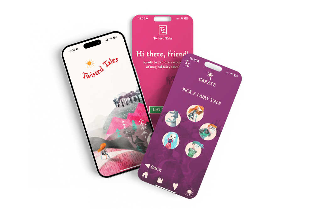
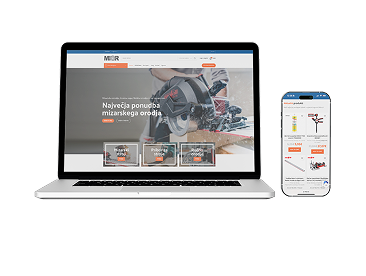
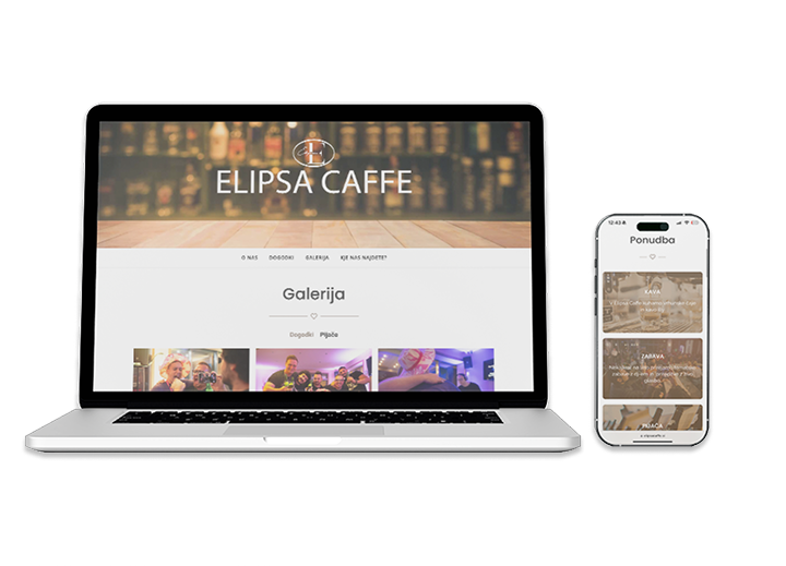
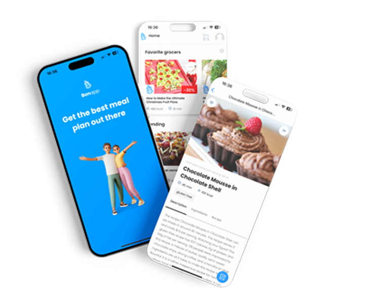
We’ve delivered over 30 online stores and 20 mobile apps at Roakon, and one pattern is clear: the simpler the navigation, the more enquiries. The fix? Ruthlessly cut the menu down, make contact info sticky, and test the path yourself (on both desktop and mobile).
4. Slow and Clunky on Mobile
There’s a special frustration reserved for trying to tap a tiny phone number on a mobile site, only to have the screen jump or the number not be clickable. Or waiting for a giant hero image to load while you’re standing in the rain, searching for a locksmith.
Across 100+ client projects at Roakon, we see mobile speed and usability kill more leads than almost anything else. A site can look beautiful on desktop and be a conversion graveyard on mobile. Google will show you the bounce rate, but your users will just vanish.
The fix:
- Compress images and test load speed (aim for under 3 seconds)
- Make phone numbers clickable
- Test every contact form on multiple devices
If the mobile experience is slow or broken, your traffic is just window-shopping — and walking away.
5. No Social Proof, No Confidence
If you’ve ever scrolled through a website and found yourself thinking, “Has anyone actually hired these people?” — you’re not alone. This is the missing ingredient on most service business websites in Slovenia, especially smaller firms.
You can say you’re the best until you’re blue in the face; nothing beats a real testimonial, a Google review, or a case study. We built a site for a local healthcare provider last year at Roakon, and watched their enquiry rate triple after we added video testimonials and embedded their real Google reviews. Suddenly, visitors weren’t just taking their word for it — they were seeing proof from people like themselves.
The fix: collect reviews, publish them, and keep them current. One quote from a happy client (“They fixed my leak in 30 minutes, on a Sunday!”) is worth a thousand words of self-praise.
What We See, What Actually Works
Across more than 100 projects, the pattern is always the same. Traffic without enquiries means something is blocking trust or action. The solution is never a mystery feature or a new ad campaign. It’s almost always one of these basics, overlooked because they seem too obvious or too small to matter.
We’ve watched businesses go from “nobody ever calls” to “we can’t keep up with the enquiries” by fixing just two or three of these points. There’s no secret sauce — just a relentless focus on the experience real humans have on your site. If you want your service business website to convert, start with these five fixes before you spend another euro on traffic.
If your website is getting visitors but the phone never rings, you’re not alone — and you’re not stuck. The fix is usually right there in front of you, waiting to be noticed and acted on.
Let’s build something great together!
Ready to take your digital presence to the next level?
Reach out to us at info@roakon.eu and let’s create something remarkable.