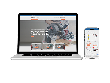


The email arrived at 8:37am: “We’ve just launched, but orders are flat. Analytics says 68% of visitors are on mobile. What’s wrong?” And there it was again—the pattern that shows up in almost every third project we review. A beautiful desktop site, pixel-perfect, but something breaks the moment you pick up a phone and try to buy a pair of shoes, a pizza, or a new set of tires. Suddenly, the process that felt smooth at your desk is now a slow-motion obstacle course.
We’ve sat with business owners staring at their phones, thumb hovering hesitantly, squinting at a product image that won’t zoom, hunting for the add-to-cart button that’s half-hidden behind a sticky banner. The frustration is real. Mobile traffic is the majority for almost every online store, but you wouldn’t know it from how most sites are built. And every tap, every second of confusion, is costing real sales—often without anyone realizing just how much is slipping away.
Desktop-First Design: The Hidden Revenue Leak
Here’s what we see across projects: store owners, designers, and even some agencies still treat mobile as an afterthought. The desktop version is the “real” store; mobile is just a cramped translation. But your customers didn’t get that memo. For a typical client we’ve worked with, mobile accounts for 60–75% of sessions. Yet the majority of abandoned carts, bounce rates, and customer complaints? Also mobile.
It’s rarely a single catastrophic bug. It’s death by a hundred papercuts:
- Tap targets so small, you need surgeon’s hands to select a color.
- Checkout forms that require scrolling sideways or pinching to read.
- Images that take 6 seconds to load on a 4G connection.
- Buttons that live just outside thumb reach, or disappear under chat widgets.
The cost? Every friction point is a dropped basket. The customer doesn’t send feedback—they just close the tab. Multiply that by dozens or hundreds per day, and the revenue leak is no longer hidden.
Thumb Zones and Tap Targets: The Anatomy of a Mobile Sale
Most businesses miss a crucial truth: mobile e-commerce is about ergonomics, not just screen size. Where does your customer’s thumb naturally rest? Can they reach the “Buy Now” button without stretching or switching hands? We’ve seen checkout flows where the final purchase button is so close to the phone’s bezel, even we fumbled to click it during testing.
The best-performing stores we’ve built or reviewed have a simple rule: every interactive element—add-to-cart, size selector, quantity—lives within the “natural thumb zone.” Tap targets are never under 48x48px. This isn’t design trivia; it’s the difference between a completed order and a bounce. When we show clients heatmaps of how users interact, the pattern is almost always the same: missed taps, accidental exits, or endless back-and-forth trying to tap the right spot.
Mobile Checkout: Where Sales Go to Die (or Succeed)
If we had a euro for every time a client said, “People add to cart, but they don’t finish,” we’d have a second office in the Alps. The culprit? Checkout flows built for keyboards, not thumbs. Forms with ten fields, address autocomplete that doesn’t work on mobile, or payment popups that require rotating the phone just to see the submit button.
One client told us: “We’ve been live for six months and nobody calls, nobody complains. But we know people want to buy—what are we missing?” After testing their mobile checkout, we found the continue button was covered by a sticky GDPR banner. No error, no warning—just a dead end. Classic.
What we see across 30+ online stores at Roakon: the shorter the checkout, the higher the conversion. Autofill, single-step checkout, and payment methods like Apple Pay or Google Pay can double mobile conversion rates compared to clunky, multi-page forms. But the real magic is in relentless user testing—with real thumbs, not just a developer’s mouse.
Image Weight and Mobile Data: The Silent Killer
Another classic pitfall: images that look stunning on a Retina MacBook but take ages to load on a phone with spotty data. We’ve seen stores where the homepage banner alone was 5MB—enough to make a customer’s connection crawl. On a desktop, you hardly notice. On mobile, it’s enough to lose half your users before your store even loads.
Here’s what helps across dozens of builds:
- Serve responsive images (WebP or AVIF) at the actual size needed for mobile.
- Lazy-load below-the-fold images so only what’s visible loads first.
- Compress aggressively—your mobile shoppers want speed more than pixel perfection.
Every extra second of load time costs conversions—on average, we see 20–30% more completed purchases on stores where mobile image weight is under control. This is the kind of technical detail that rarely makes the marketing plan, but it shows up in the sales figures every single day.
A Real Example: When Mobile UX Doubled Sales
In one of our recent online store projects at Roakon, the client was convinced their site was “already mobile-friendly”—the theme scaled down, the menu collapsed, and everything technically fit on a phone. But when we ran a round of real-world user testing, we saw the same pattern: users struggled to tap size selectors, abandoned checkout when faced with a multi-step form, and waited 8 seconds for product images to appear on 3G.
We rebuilt key flows around mobile-first design: larger tap targets, sticky add-to-cart within thumb reach, one-tap checkout, and optimized images. The result? Mobile conversion rate more than doubled in the first month. The desktop version barely changed—but mobile sales became the main engine of growth. That’s the reality across our 100+ projects: small, precise mobile UX changes have an outsized impact on revenue.
What Most Businesses Miss (And What To Do Next)
The truth is, most teams working on online stores are still reviewing designs on big screens, not on phones. They might resize a browser window and call it a day. But responsive design isn’t enough. Mobile e-commerce is its own discipline—part ergonomics, part psychology, part technical optimization.
Here’s the checklist we wish every client used before launch:
- Test every flow on a real phone—ordering, payment, even contacting support.
- Watch someone unfamiliar with your store try to buy something on mobile.
- Measure load times on 3G/4G, not just WiFi.
- Check thumb reach and tap target sizes—no tiny buttons in unreachable corners.
And if you’re looking for a partner who’s seen (and fixed) these mistakes across 30+ stores and 20+ mobile apps, Roakon can help. But even without an agency, the mindset shift is what matters most: treat mobile as the main event, not a side project.
Conclusion: The Real Cost of Getting Mobile Wrong
The biggest myth in online retail is that “responsive” means “good enough.” It doesn’t. Mobile e-commerce is where most sales are won—or quietly lost. The difference is rarely flashy; it’s in the details: thumb zones, tap targets, checkout friction, image weight. We’ve learned this by working with more than a hundred clients, across every kind of business. The pattern is always the same: fix mobile, and the sales numbers finally make sense.
Let’s build something great together!
Ready to take your digital presence to the next level?
Reach out to us at info@roakon.eu and let’s create something remarkable.