


The support ticket came in at 7:52 AM. Subject line: “Checkout not working (MOBILE)!!!” The owner of a fast-growing Slovenian fashion brand was already on her second coffee, scrolling through last night’s sales. She’d noticed something off—a spike in abandoned carts, all from mobile users. Her phone buzzed again. A WhatsApp message from her cousin: “Hey, I tried to buy those shoes but your site’s payment button is too small! Gave up.” There’s a moment of silence when she realises it’s not just her cousin. It’s hundreds of people, every single day, getting stuck or giving up for reasons she never sees on her desktop screen.
This is the moment we get called. Someone’s finally spotted the gap: the online store looks beautiful on a laptop, but on a phone, it’s like trying to thread a needle with ski gloves. The owner is frustrated, but not surprised. She’s heard complaints, but always assumed “responsive” meant “good enough.” Now it’s costing her real money, and the numbers are staring her in the face.
Where Most Stores Go Wrong: Desktop-First Thinking
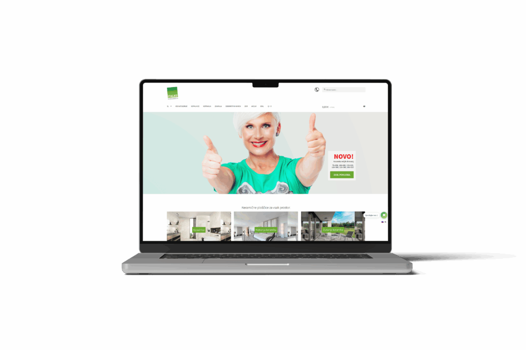
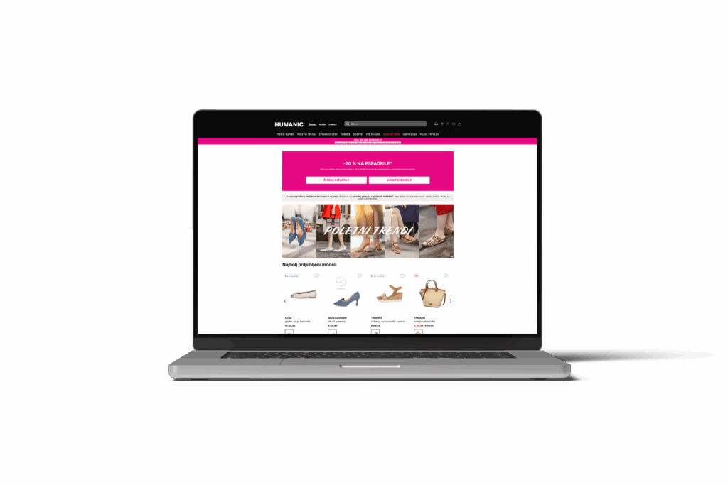
Here’s the pattern we’ve seen across more than 30 online stores: the desktop version gets all the love. The homepage banners are huge and lush. The navigation is logical—if you have a mouse. But try the same site on a phone. Menus collapse into tiny hamburger icons tucked in the far corner. Product images take forever to load on slow data. Add-to-cart buttons shrink into a narrow strip, perfect for accidental taps or missed clicks.
The irony is, most store owners make their buying decisions on a desktop, in an office. Their customers? Over 65% of sessions (in real analytics, not a random stat) now come from mobile. But those customers are wrestling with clumsy filters, pop-ups that won’t close, and forms that ask for everything short of a blood sample.
What’s breaking isn’t just the layout. It’s the entire experience of buying on a phone—one thumb, one screen, one fleeting moment before something more interesting comes along.
Thumb Zones and Tap Targets: The Invisible Roadblocks
If you’ve ever watched someone shop on their phone, you know the dance: scrolling with a thumb, stretching for distant buttons, squinting at tiny product images. Most online stores are designed in big rectangles, but real mobile users operate in circles—the natural arc of a thumb.
Here’s what we see go wrong, over and over:
- Add-to-cart and checkout buttons are placed just out of easy reach, leading to missed taps.
- Tap targets (the clickable area) are too small, making it easy to hit the wrong thing or nothing at all.
- Sticky navigation covers important content or is so thin it’s useless for big thumbs.
These aren’t minor annoyances—they’re silent revenue leaks. Every time a user fumbles and fails, that’s a lost sale. Nobody emails support to say, “Your button was 8 pixels too narrow.” They just vanish, often for good.
Mobile Checkout: Where Most Abandonment Happens
“The client said: ‘We’ve been live for 6 months and nobody calls. But I just tried to check out on my phone, and it’s a disaster.’” That’s always a tough call to get, because by the time the pain is obvious, it’s been happening for weeks or months.
Mobile checkout is where the wheels tend to fall off. Here’s what typically breaks:
- Endless forms with dozens of fields (address, phone, email—sometimes twice).
- Mandatory account creation before buying—guaranteed drop-off.
- Payment popups that don’t resize, making the “Pay” button unreachable on smaller screens.
In one project, we saw a 40% drop in mobile checkout completion compared to desktop. No technical bug, just a sequence of small UX missteps: a postcode field that was hard to tap, a “Terms and Conditions” checkbox you had to scroll to find, a credit card input that autocorrected numbers (never a good idea).
Image Weight and Loading Times: The Silent Conversion Killer
A retailer uploads crisp, high-res product shots that look gorgeous on a 27-inch monitor. But on a phone, especially over a slow 4G connection, each image can take several seconds—or never finish loading at all. The result? Users see a spinning wheel instead of that perfect leather bag, and most won’t wait.
We’ve seen stores where mobile bounce rates spiked simply because the homepage banner was a 4MB file. Customers in rural areas or on limited data plans abandon the site before even seeing what’s for sale. In our experience, every megabyte over 1MB costs you sales—and image compression is almost always overlooked in the rush to launch.
Real-World Fixes: What Actually Works
After working on 100+ digital projects, we’ve learned that mobile e-commerce is its own discipline—not just a smaller screen, but a different mindset. For one hospitality client, their online store had a beautiful desktop design, but Roakon was brought in after months of dismal mobile conversion rates. Our audit found:
- Key buttons sitting in “dead zones” unreachable by the average thumb.
- Font sizes too small for quick scanning.
- Images not optimised for mobile loading speeds.
We rebuilt the mobile UX, prioritising thumb-friendly layouts, larger tap targets, and a mobile-first checkout flow that reduced steps and pre-filled as much information as possible. The result? Abandonment rates dropped, and the owner stopped getting frantic WhatsApps from friends trying to buy on their phones.
Mobile-First Design: More Than Just “Responsive”
There’s a difference between “responsive” and “mobile-first.” Responsive design adapts your desktop site to fit a phone—it’s a technical solution. Mobile-first design starts with the phone in mind, making every decision for the person holding a device in one hand and a coffee in the other.
At Roakon, we see the same pattern: stores that launch “responsive” often miss the nuances that drive real mobile sales. If you’re not testing every step of the journey—from home to checkout—on a real phone, you’re leaving money on the table.
What It’s Costing You (And How to Spot the Signs)
If your Google Analytics dashboard shows strong mobile traffic but weak mobile sales, you’re not alone. We see this disconnect in almost every project before a redesign. The signs are there if you look:
- Abandoned carts spike on mobile devices.
- Support tickets and complaints focus on checkout problems, not product selection.
- Heatmaps show users struggling with navigation or tapping unresponsive buttons.
The cost is more than numbers on a spreadsheet. It’s lost trust, frustrated customers, and the silent churn of people who wanted to buy but couldn’t. The good news: every one of these issues is fixable—if you design for real mobile users, not just screens.
Most online stores are beautiful on a monitor, but business actually happens on phones. Every pixel, every tap, every loading image is a chance to win or lose a customer. After 100+ projects, we’ve seen the same lesson: if you make it easy for their thumbs, you make it easy for their wallets.
Let’s build something great together!
Ready to take your digital presence to the next level?
Reach out to us at info@roakon.eu and let’s create something remarkable.