


The first email arrived at 10:12am. Subject line: “Intro call?” The sender sounded interested, but cautious. Two sentences in, they asked for a link to the website “to see more about your team and projects.” Milan, who’d been at his desk since eight, copied the URL, pasted it, and hit send. He waited. Two hours passed. No reply.
By lunch, Milan was refreshing his inbox, replaying the conversation with his boss from last week: “Just get more leads. We need the pipeline full.” The stack of business cards from last month’s networking event sat untouched in his top drawer. Milan had handed out twenty. Not a single call. But somehow, everyone who got in touch wanted to see the site first.
It’s a pattern we see almost every week: a business spends years perfecting presentations and print materials, but the website — the thing every serious prospect checks before making contact — is left as an afterthought. Nobody talks about the “credibility gap” out loud, but you know it when you feel it: a lead goes cold, a deal stalls, your inbox is quieter than it should be. What happened between handshake and hello?
The Real First Impression: It’s Not Your Card
We’ve watched this play out across 100+ client projects. The moment a business card changes hands, the recipient does the same thing: Google the company, click the top result, and scan for red flags. Your business card might be glossy and clever, but your Google search result is the real handshake.
If you rank first, but your meta description is a garbled sentence from 2017, you’ve already lost points. If your site loads slowly, or worse, returns a security warning, you don’t get a second chance. We’ve heard it in direct feedback: “I was interested, but your site felt risky.” Nobody wants to be the one who recommended a vendor that looked dodgy online.
In B2B and services, especially, website trust is the silent gatekeeper. Before you ever get to pitch, your site has already spoken for you.
The Modern Credibility Checklist
There’s a checklist that most prospects run — consciously or not — the moment they land on your site. We see it in user testing, and we hear it in client conversations. Here are the real make-or-break points:
- Performance: If your site takes more than 3 seconds to load, half your audience is already rolling their eyes.
- SSL Security: No padlock, no trust. Even non-technical buyers look for that little lock symbol.
- Visible Team: If nobody’s face appears, it feels like a shell operation. People want to know who they’re dealing with.
- Clear Services: If your offer isn’t obvious in under 10 seconds, most visitors won’t bother to figure it out.
- Real Reviews: Testimonials with names and faces. Bonus points for links to real companies.
- Frictionless Contact: Nobody wants to search for your email or fill out a 10-field form just to say hello.
It sounds basic, but this is where most businesses drop the ball. The credibility gap isn’t about flashy design — it’s about removing hesitation and building trust with every click.
What B2B Prospects Actually Do (Not What We Wish They Did)
We’ve sat next to real buyers as they vet vendors. The steps are almost always the same. They Google you. They scan your homepage. They look for a team page. They scroll to find reviews or case studies. They check if the site feels “alive” — recent posts, updated copyright, maybe a quick social media check.
One client told us, “We’ve been live for 6 months and nobody calls.” When we shadowed a prospect’s path, it was clear why: their contact form was buried, the team page was “under construction,” and the only testimonial featured was from 2018. The site was a museum, not a shopfront.
It’s easy to forget: Most people decide if they trust you in the first 30 seconds. They don’t read your content. They glance, judge, and move on if anything feels off.
The Hidden Risks of an Unprofessional Website
We’ve worked with businesses across retail, hospitality, healthcare, and more. The pattern is always the same: when your site doesn’t meet basic credibility standards, you don’t just lose leads — you lose trust you never even knew you had. The silent majority never calls to say why they passed. They just disappear.
We’ve seen sites where missing SSL certificates killed deals before they started. Or where confusing navigation made a logistics company look amateur. In B2B, buyers are risk-averse. If your digital presence looks risky, you’re off the shortlist, no matter how good your service or product is.
Nobody cares about your clever logo if your site feels abandoned or hard to use. As harsh as it sounds, an unprofessional website is invisible — or worse, a red flag.
A Portfolio Example: Closing the Credibility Gap
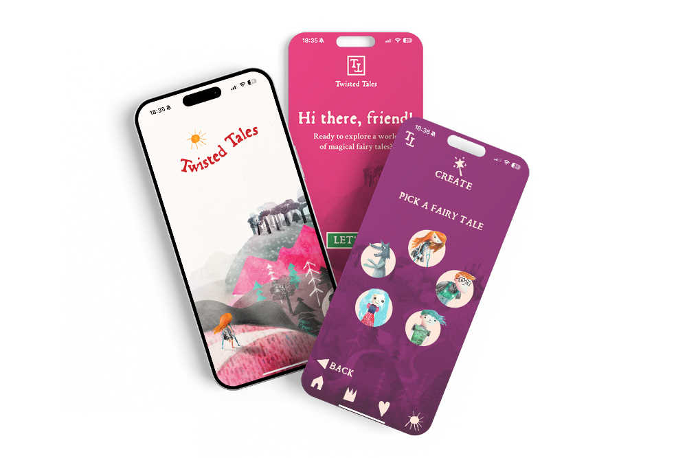
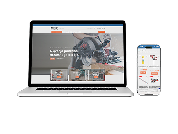
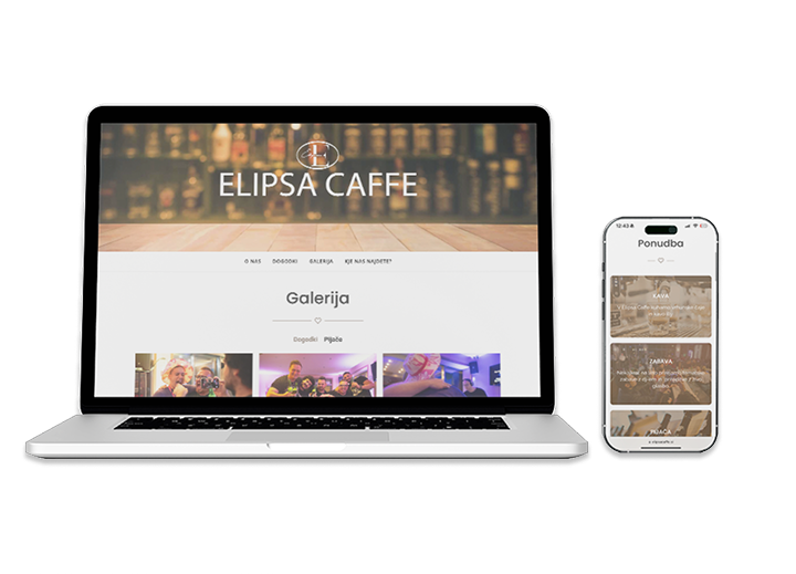
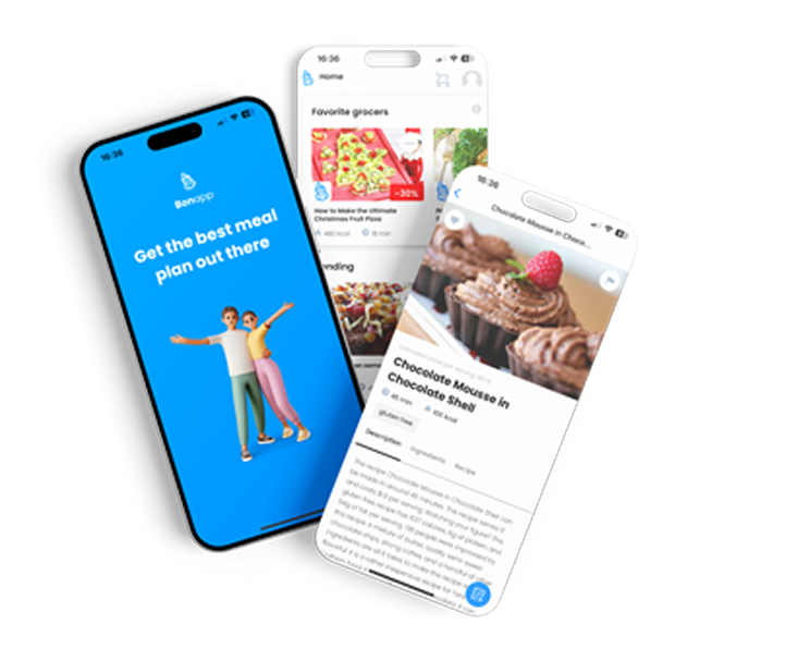
One of the most common requests Roakon gets from established B2B firms: “We’re not getting the leads we expect. Can you take a look at our site?” In over 30 online store projects and 20+ web apps, the root issue is almost always the same: the website doesn’t match the professionalism of the business.
Take a recent project for a service provider (no names, but you’d know the industry). Their old website was technically functional, but the team was hidden behind generic stock images, the contact form was glitchy, and reviews were nowhere to be seen. We rebuilt with:
- Real team bios and photos
- Clear, up-to-date service pages
- Prominent, verified testimonials
- A one-click contact option (no hunting required)
- Fixed performance issues and full SSL coverage
Within weeks, inbound contact doubled. The credibility gap closed — not because we added bells and whistles, but because the site finally reflected the real business behind it. This isn’t a one-off; it’s what we see across dozens of launches.
Why Business Cards Still Matter (But Not How You Think)
We’re not saying to toss your business cards. In some industries, they’re a ritual — a cue for introductions and a physical reminder of a conversation. But here’s the reality: the card is just a prompt for the real investigation. The moment someone leaves the room, or even before, they’re searching for your company online.
If your website doesn’t hold up under scrutiny, the best-designed card in the world can’t save you. Prospects want to see proof — of your team, your track record, your professionalism — before they invest time in a call. The credibility checklist has replaced the elevator pitch.
And let’s be honest: how many times have you ended up Googling someone five minutes after a meeting, just to make sure they’re legit?
Building Real Trust: Lessons From 100+ Digital Projects
There’s nothing magical about credibility online. It’s built step by step: clear information, visible team, updated content, frictionless contact, and proof of past performance. The technical layer matters too — SSL, fast performance, no broken links. Across 100+ projects, the businesses that thrive are the ones that treat their website as their first impression, not an afterthought.
If you’re wondering why leads have dried up, or why conversations stall after you share your URL, don’t blame the market. More often than not, it’s the credibility gap speaking for you. Roakon has rebuilt online stores and apps for clients who were “invisible” before launch, and the shift is always the same: professional website, professional enquiries.
If you want to win trust in B2B, don’t start with your business card. Start with what happens when someone Googles your name — and what they see when they land on your site.
Let’s build something great together!
Ready to take your digital presence to the next level?
Reach out to us at info@roakon.eu and let’s create something remarkable.