


The phone rings, but the owner doesn’t answer. They’re staring at their analytics dashboard, watching another visitor land on the homepage—then disappear. Bounce, bounce, bounce. There’s a pit in their stomach. They paid for a “beautiful” homepage. But conversions are flatlining and email signups are a trickle. It’s 11:34 AM and the only thing growing is doubt.
If you’ve ever clicked “refresh” hoping for a miracle, you’re not alone. Across more than 100 projects, we see this pattern almost every week: someone launches a website, expecting traffic to turn into leads or sales. Instead, most visitors leave before anything happens. Not because the product is bad, but because the homepage doesn’t do its job—fast enough.
This isn’t about pixels or colour palettes. It’s about value—what your homepage is costing you right now, and what it could return if it worked as hard as you do. Let’s talk about what those eight seconds at the top of your site are truly worth.
The 8-Second Window: Why Visitors Leave Before You Know Their Name
Every homepage gets about eight seconds to make its case. That’s not a myth, that’s what we see in analytics for real businesses—sometimes even less. In those eight seconds, a visitor unconsciously asks three things:
- What is this?
- Is this for me?
- What do I do next?
If you answer all three, you keep them. If you miss even one, they’re gone. And with every bounce, you’re paying twice: once for the traffic, and again for the lost opportunity. We’ve seen online stores spend €2,000 a month on ads only to lose 80% of visitors before the page even loads.
What is This? The Cost of Confusion
“I thought you sold shoes, not accounting software.” That’s a real quote from a user test. The homepage had a beautiful photo, a clever slogan, and zero context. Visitors had to scroll—or guess—to figure out what the business actually offered. Most didn’t bother.
Every unclear homepage costs you real money. If only 1 in 5 visitors understands what you do, you’re instantly burning 80% of your marketing budget. For a site getting 2,000 visits a month, that’s 1,600 wasted clicks—every month. At €1 per click, that’s €1,600 just to confuse people.
The fix? A clear, specific headline, visible above the fold, with a single sentence that spells out what your business is. Not “Empowering Solutions for Tomorrow”—but “Accounting Software for Slovenian Freelancers.”
Is This For Me? Why Most Homepages Are Too Vague to Convert
The next hurdle is relevance. Even if visitors know what you do, they need to know you’re the right fit. Too many homepages try to appeal to everyone and end up resonating with no one. This is where businesses lose high-value leads.
We see this across retail, hospitality, healthcare, and especially B2B: vague promises, generic images, and no sign of who the offer is meant for. The result? Visitors think, “Maybe this isn’t for me,” and click away. If you serve local restaurants, say so. If your app is built for logistics managers, show it in the headline and imagery.
The value here is simple: targeted messaging can double or triple conversion rates. We’ve seen stores go from 1% to 3% conversion just by clarifying their niche in the first screen. For a modest store, that’s the difference between 10 and 30 sales per month—without changing the product or the ads.
What Do I Do Next? The Art (and ROI) of a Single Clear Action
Here’s where most homepages fail, even the expensive ones. There’s no obvious next step. Or worse, there are five: “Learn More,” “Contact Us,” “See Our Work,” “Sign Up,” “Read Blog.” Visitors freeze, then leave. It’s not indecision—it’s friction.
We once had a client say, “We’ve been live for 6 months and nobody calls.” They had traffic, a strong offer, and a decent design. But the call-to-action was tucked away in the footer, and the main button just said “More Info.” After one change—a single, bright “Book a Free Consultation” button above the fold—calls increased by 270% in the next two months. Actual, trackable revenue followed.
This is the lowest-effort, highest-return fix you can make. A clear CTA, visible without scrolling, removes doubt and increases the likelihood of action. If you value leads at €50 each, one extra call a week is €2,600 a year—earned by moving a button.
A Self-Audit Framework: No Tech Skills Needed
You don’t need a designer or developer to check if your homepage works. Try this self-audit—borrowed from what we do at Roakon in every project kickoff:
- Open your homepage on a phone and a laptop. Don’t scroll.
- In 8 seconds, can a stranger answer: What is this? Is it for me? What do I do next?
- Ask three people outside your industry to do the same. Listen to their first impression—don’t explain, just watch.
If any answer isn’t instant and obvious, you’re losing business. This process is free. It’s also the fastest way to spot expensive mistakes before they show up in your analytics.
What We See Across 100+ Projects: Patterns and Payoffs
Across 100+ websites and online stores, the pattern is consistent: the best-performing homepages are not the prettiest, but the clearest. The businesses that invest in clarity see better conversion rates, lower bounce, and more qualified leads. The ones that chase trends or clever slogans end up paying for frustrated visitors who never become customers.
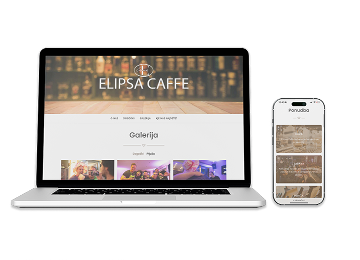
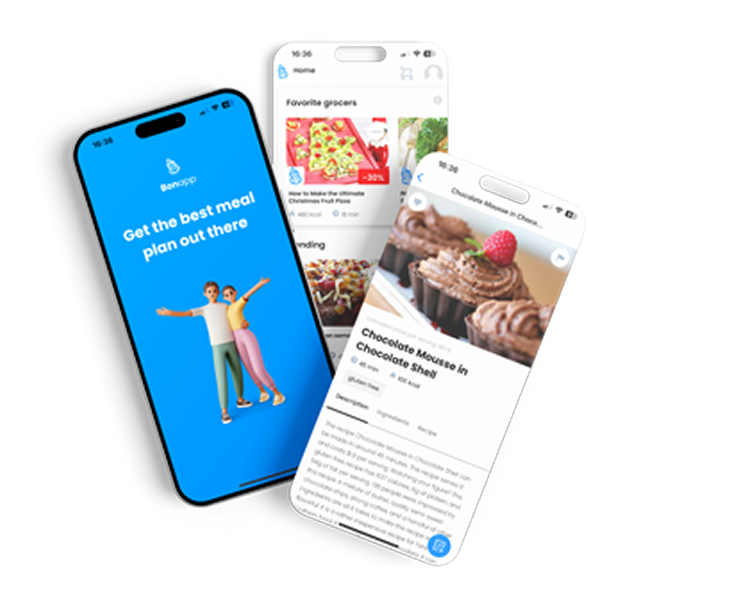
At Roakon, we’ve delivered 30+ online stores and 20+ apps. The projects that see the fastest ROI—sometimes within weeks—are the ones where the homepage answers those three questions above the fold, no ambiguity, no scrolling required. One fashion retailer doubled their newsletter signups in a single month after replacing their “mystery” hero image with a direct value statement and targeted CTA. Same traffic, twice the engagement.
Landing Page Optimisation: The Value of Every Second
Inaction is expensive. If your homepage fumbles those first 8 seconds, you’re paying for invisible mistakes—lost ad spend, wasted traffic, missed referrals. The return on fixing it is measurable: higher conversion, more leads, and more sales without increasing your marketing budget.
The first impression is not just a “nice to have”. It’s the moment your website either earns its keep or drags down your entire digital strategy. If you want the numbers to move, start above the fold. That’s the only place your visitors are guaranteed to see.
Clarity always pays for itself—usually much faster than you think. In eight seconds, your homepage can either open the door to new business or quietly close it. Make every second count.
Let’s build something great together!
Ready to take your digital presence to the next level?
Reach out to us at info@roakon.eu and let’s create something remarkable.