


It usually starts with a moment of inspiration—a founder sketching on the back of a coffee receipt, or a marketing manager staring at endless spreadsheets, wishing “there must be an app for this.” Fast-forward a few months, and that same person is at their desk, frowning at a blank screen, wondering why nothing works like they imagined. The app is late. The budget is blown. Nobody’s sure who was supposed to do what. There’s a silent, uncomfortable question in the room: “Did we miss something important at the start?”
If you’ve felt that knot in your stomach, you’re not alone. We talk to plenty of people who thought building an app meant “hire a developer, write code.” Then reality hits: users are confused, features are missing, the App Store review comes back with a rejection. The process is never as linear—or as simple—as you’d hope. But the warning signs are usually there, long before a single line of code is written.
The Symptom: “We know what we want—just build it!”
The first and most common symptom: a team arrives, full of excitement, with an idea. “We just want an app that does X. Can you build it? How much will it cost?” No one has written down what X actually means. No one has mapped the user journey, or asked real customers what they need. But the expectation is to jump straight into development.
Diagnosis? Skipping the discovery phase—where you define, challenge, and refine the idea—means you’re building on sand. In our experience across 20+ mobile app projects, this is where the snowball of confusion first forms. Later, that snowball becomes an avalanche.
The fix: Insist on a discovery workshop. Map out your goals, users, and what a “successful” app actually looks like. At Roakon, we’ve seen even the simplest apps benefit from a two-day deep dive, where assumptions get tested against reality. It’s rarely a waste of time—more often, it prevents months of rework.
The Symptom: Endless Features, No Structure
Another classic: the feature list that grows like wild ivy. “Let’s add chat! And payments! And a dashboard! And notifications!” Before long, the team is lost. There’s no hierarchy, no sense of what matters most. Developers are left asking, “So… what’s the first screen?”
Diagnosis? Skipping wireframes and prioritisation. In the rush to “just get started,” it’s easy to overlook the skeleton of the app. We’ve seen projects where months in, the only thing everyone agrees on is that nobody knows what’s finished and what isn’t.
The fix: Start with wireframing—quick, low-fidelity sketches of each screen. List your must-haves vs nice-to-haves. It’s amazing how much gets clarified when you force yourself to draw the flow. In our projects, this is the step where teams realise which features actually drive the user journey, and which are distractions.
The Symptom: “We built a prototype—now what?”
You’ve got clickable mockups. They look great. Everyone internally is nodding along. But when you show them to three real users, the results are… confusing. “Wait, what does this button do?” “I thought I was booking, but nothing happened.” Suddenly, the beautiful prototype feels wobbly.
Diagnosis? Skipping user testing—or only testing with insiders, not real customers. We see this mistake all the time: teams are so close to the idea, they forget that fresh eyes will spot problems instantly. We’ve heard it straight from clients: “We’ve been live for 6 months and nobody calls. Turns out, people can’t even find the contact button.”
The fix: Test the prototype with people outside your bubble. Watch them use it, listen to their confusion, and iterate. At Roakon, we build in at least one round of user testing before development sprints begin. It’s the fastest way to catch dead ends before they’re set in code.
The Symptom: Sprints That Never End
You’re finally developing. There’s a project board, user stories, and weekly sprints. But deadlines slip. Bugs multiply. Features aren’t done, but new ideas keep arriving. The project feels like it’s running on a treadmill—lots of motion, not much progress.
Diagnosis? Lack of discipline in sprint planning. In our experience (20+ mobile apps built), projects go off the rails here when teams try to code and redesign at the same time. Developers get whiplash from shifting requirements. Testers are never quite sure what’s ready to check.
- Features aren’t locked before sprints
- Testing is treated as an afterthought
- “Quick changes” sneak in, breaking what worked yesterday
The fix: Set clear sprint boundaries. No scope changes mid-sprint. Prioritise fixes before adding new features. At Roakon, we’ve found that regular demo sessions (even if things aren’t perfect yet) keep everyone honest—and force early feedback before things drift too far.
The Symptom: “It works on my phone…”
You’ve hit “build.” The app looks great in the simulator. But then someone opens it on an older device, or with a different language setting, or in low connectivity—and chaos ensues. Layouts break. Buttons disappear. There’s a crash no one can reproduce.
Diagnosis? Incomplete testing. A common pitfall, especially for small teams, is assuming “if it works for us, it’s good enough.” In reality, that’s the surest way to rack up App Store rejections and one-star reviews. We’ve seen apps fail in the final App Store review because a single permission wasn’t handled correctly.
The fix: Test on as many real devices as possible. Use beta testers outside your team. Run through every App Store guideline—especially around privacy and permissions. At Roakon, we keep a library of test devices (from ancient Androids to the latest iPhones) for this exact reason. It’s not glamorous, but it saves launches from last-minute disasters.
The Symptom: “The App Store rejected us—now what?”
You’re ready to launch. Screenshots are uploaded. The app is “waiting for review.” Then the email arrives: rejected. Maybe it’s a missing privacy policy. Maybe it’s a crash on iPad. Maybe you used a forbidden API. Suddenly, the finish line moves weeks further away.
Diagnosis? Underestimating the App Store submission process. It’s not just a technical checklist—it’s a legal and content review. Over dozens of launches, the pattern is always the same: teams assume Apple/Google’s rules are just suggestions. They aren’t.
The fix: Read the review guidelines early—before you write a single line of code. Prepare privacy policies, terms, and support contacts in advance. Test every device and user flow. In one recent Roakon project for a retail client, our pre-launch checklist caught a geolocation permission issue that would have blocked App Store approval. Fixing it early saved weeks of frustration.
From Idea to App Store: The Real Prescription
Building an app isn’t just about development. The process is a series of critical checkpoints, each with its own risks and remedies. The projects that reach the App Store—and actually succeed there—are the ones that catch symptoms early, diagnose them honestly, and apply the right fix at the right stage.
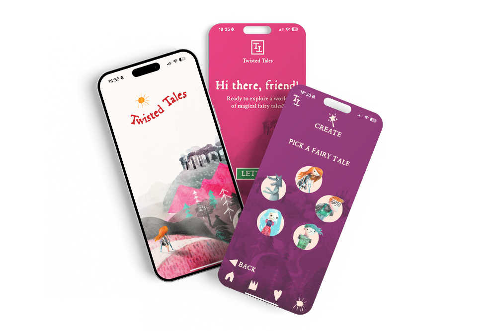
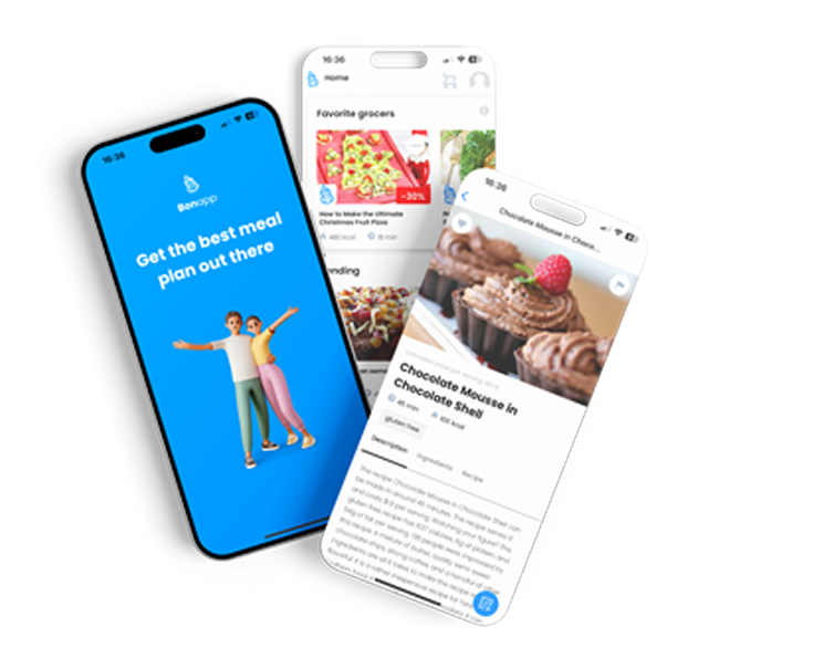
After working with 100+ clients on 20+ mobile apps, the pattern is clear: the less you rush, the faster you finish. Every phase has its own hidden traps, but also its own opportunities to build something users will actually love.
Let’s build something great together!
Ready to take your digital presence to the next level?
Reach out to us at info@roakon.eu and let’s create something remarkable.