


It’s 09:37 on a Thursday. You’re staring at your site’s analytics dashboard, watching the bars climb — 200 visitors this week, maybe 300 by Friday. But the red notification dot on your CRM is as motionless as ever. No new leads, no phone calls, not even a stray contact form submission to brighten your inbox. There’s a half-drunk coffee on your desk and a growing sense of: “What exactly am I missing?”
We see this scenario more often than anyone admits. You’re doing the awareness work — SEO, maybe a bit of Google Ads, content that’s not half-bad. There’s traffic. But the phone? Silent as a library at midnight. You’re left wondering if your business is invisible, or if your visitors are just ghosting you for fun.
Let’s walk through the five biggest myths that keep service business websites busy but not profitable — and what actually gets the phone ringing again.
Myth 1: “If They Want to Contact Us, They’ll Find a Way”
This is the classic. The “our contact details are in the footer” approach. The belief is simple: if someone really needs your service, they’ll click around and hunt for your number or email.
Reality check: website visitors are busy, distracted, and one click away from a competitor. If your call-to-action (CTA) is buried, vague, or missing altogether, most will leave without a trace.
We’ve reviewed over 100 live sites for clients and this is the single most common conversion killer. We’ve seen “Contact” hidden in drop-down menus, forms that open on page 6, and phone numbers that only appear on desktop views. One client said, “We get compliments on the design, but nobody calls.” Turns out, their CTA was a pale grey button in the footer. Problem solved in 24 hours — and suddenly, enquiries started trickling back in.
- Put your CTA — “Call Now”, “Book a Consultation”, “Request a Quote” — in the site header, on every relevant page, and above the fold.
- Make sure the phone number is clickable on mobile.
- Test: Can a visitor contact you in two clicks or less? If not, simplify.
Myth 2: “People Trust Us Because We’ve Been Around for Years”
There’s a quiet confidence that comes from years in business. Maybe your team has two decades of experience, or you’re a local staple. But online, your site is judged in seconds — and if you don’t show clear trust signals, most visitors won’t take your word for it.
We see this especially with professional services and trades. The assumption is that a simple “About Us” page or a familiar logo is enough. But when we run user tests, visitors say things like: “Do they have insurance? Are they certified? Who are their real clients?” Silence on these fronts equals suspicion.
The fix is simple, but often skipped:
- Add association badges, certifications, and years in business — near your CTA, not hidden on a subpage.
- Display client logos, especially if you’ve worked with well-known companies.
- Show real photos of your team and business premises. Stock photos don’t build trust.
Myth 3: “If the Navigation Is There, People Will Use It”
It’s tempting to think that as long as every service has a menu item, you’re safe. But confusing navigation is a silent lead killer. We see everything from 12-item mega-menus to service lists that read like a riddle.
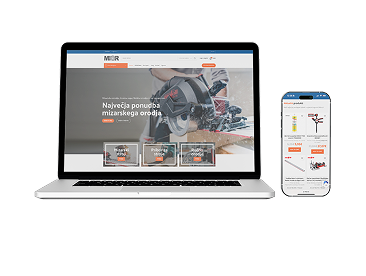
A recent Roakon project for a logistics company in Slovenia made this painfully clear. Their original navigation grouped unrelated services together and buried the “Request a Quote” button three layers deep. After restructuring to show only the main three service categories and placing the enquiry button on every page, their website enquiries doubled within six weeks. The client said: “I used to get calls asking if we even offered this service. Now, people know exactly what we do — and reach out.”
If a visitor can’t find what you offer in five seconds, you’ve lost them. Navigation should be simple, logical, and focused on your highest-value services.
Myth 4: “Everyone Uses a Computer for This Stuff”
Still designing for desktop-first? The myth persists in many boardrooms: “Our clients are B2B, so they’re at their desks.” Yet, across 30+ online store launches and 100+ websites, mobile traffic is consistently 50% or more — even for law firms and consultancies. The kicker: conversion rates on mobile lag way behind desktop when the mobile site is slow or clunky.
We’ve run into mobile issues ranging from unreadable forms, sticky pop-ups that hide the contact button, to phone numbers that aren’t clickable on phones (yes, it happens). One client’s site loaded in six seconds on 4G. When we fixed this, their bounce rate dropped by a third — and for the first time, leads came in from mobile visitors.
- Test your site on multiple devices and connections. Google’s PageSpeed Insights is free and brutal.
- Prioritise fast loading, large tap targets, and forms that are easy to fill on a phone.
- Make your phone number a tap-to-call link.
Myth 5: “If We Do Good Work, Reviews Will Take Care of Themselves”
This one is almost universal. We hear: “Our clients love us, but they’re just not the type to leave reviews.” Or: “Testimonials feel a bit self-promotional.” The problem is, social proof isn’t optional — it’s the currency of online trust.
We’ve worked with over 100 businesses and seen a direct pattern: sites with prominent reviews, testimonials, or case studies get more leads. One Roakon client, a healthcare provider, added real patient testimonials and Google reviews to their enquiry page. The phone started ringing within days. The difference? Visitors saw proof that others had a good experience — and took the leap.
How to fix it:
- Ask happy clients for a one-sentence testimonial, or permission to use their Google review.
- Display reviews near your CTAs and contact forms.
- Even one or two real quotes are better than a wall of silence.
What We Actually See Work — After 100+ Projects
The truth, from reviewing and rebuilding service business websites across Slovenia and beyond: lead generation is about trust, speed, and clarity. If you fix these five myths, you’ll be ahead of most of your competition.
At Roakon, we’ve seen sites go from “crickets” to 5–10 new enquiries a week — not with a redesign, but by tightening CTAs, adding trust signals, making navigation obvious, fixing mobile speed, and surfacing real client feedback. It’s not theory. It’s what actually moves the needle, whether you’re a local plumber or a pan-European logistics provider.
So the next time your analytics look healthy but your phone is silent, remember: traffic is easy. Conversion takes intent. And intent is built on a thousand small signals that tell your visitor, “You’re in the right place — and yes, you can trust us with your call.”
Let’s build something great together!
Ready to take your digital presence to the next level?
Reach out to us at info@roakon.eu and let’s create something remarkable.